©


Creative Strategy
The old copy explained the science because the science was the only thing anyone had thought to say.
Glutathione, Setria®, NAC, dosage, percentages — real credibility, delivered in a register that read like a supplement label, not a brand talking to a person. We kept the credibility and rebuilt the voice around it: shorter lines, a warmer register, copy that led with the feeling first and let the science back it up rather than lead it. "Brighten your day, everyday" replaced paragraph-long claims. "It's like your secret power" did the emotional work a dosage chart never could.
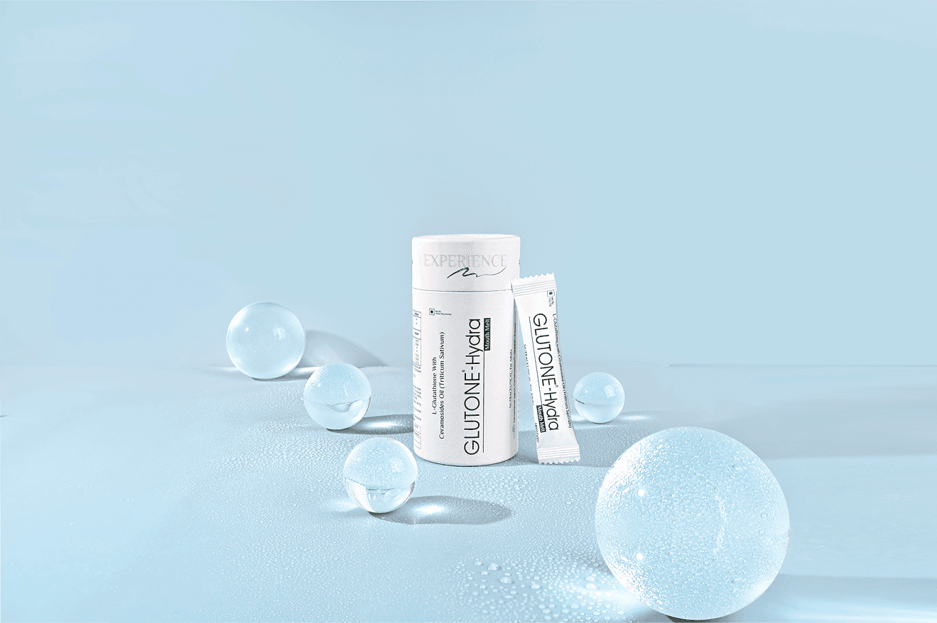
Visually, the same logic applied — strip the page back to one clear hierarchy per section, let a product breathe instead of competing with six others on the same screen, and let white space do some of the trust-building the ingredient list used to carry alone. The result reads as a brand that's confident enough to say less.

Creative Production
Full homepage redesign, plus dedicated collection pages (Radiance, Hydra) and hero product pages, including Glutone 1000.
Visual system rebuilt around simplified layouts, consistent product photography treatment, and a lighter, warmer palette than the original site. Copy rewritten across the full site — homepage, collections, and product detail pages — moving from clinical-claim language to a conversational, benefit-led voice.

Results, not prophecies
We were asked to make the site easier to read. What actually needed fixing was that nobody had decided who Glutone was talking as. Once that was settled, the design got simple on its own.
Latest projects