©

Date
Mar 2026
Client
Liquify
Industry
Fintech / Personal finance app
Timeline
6 Months

Creative Strategy
The name had to do the explaining the category couldn't.
Most fintech names lean on trust words — capital, secure, wealth. We went a different direction: Liquify, a verb, because the product is an action, not a vault. It tells the user what happens the moment they open the app, not what kind of institution is behind it.
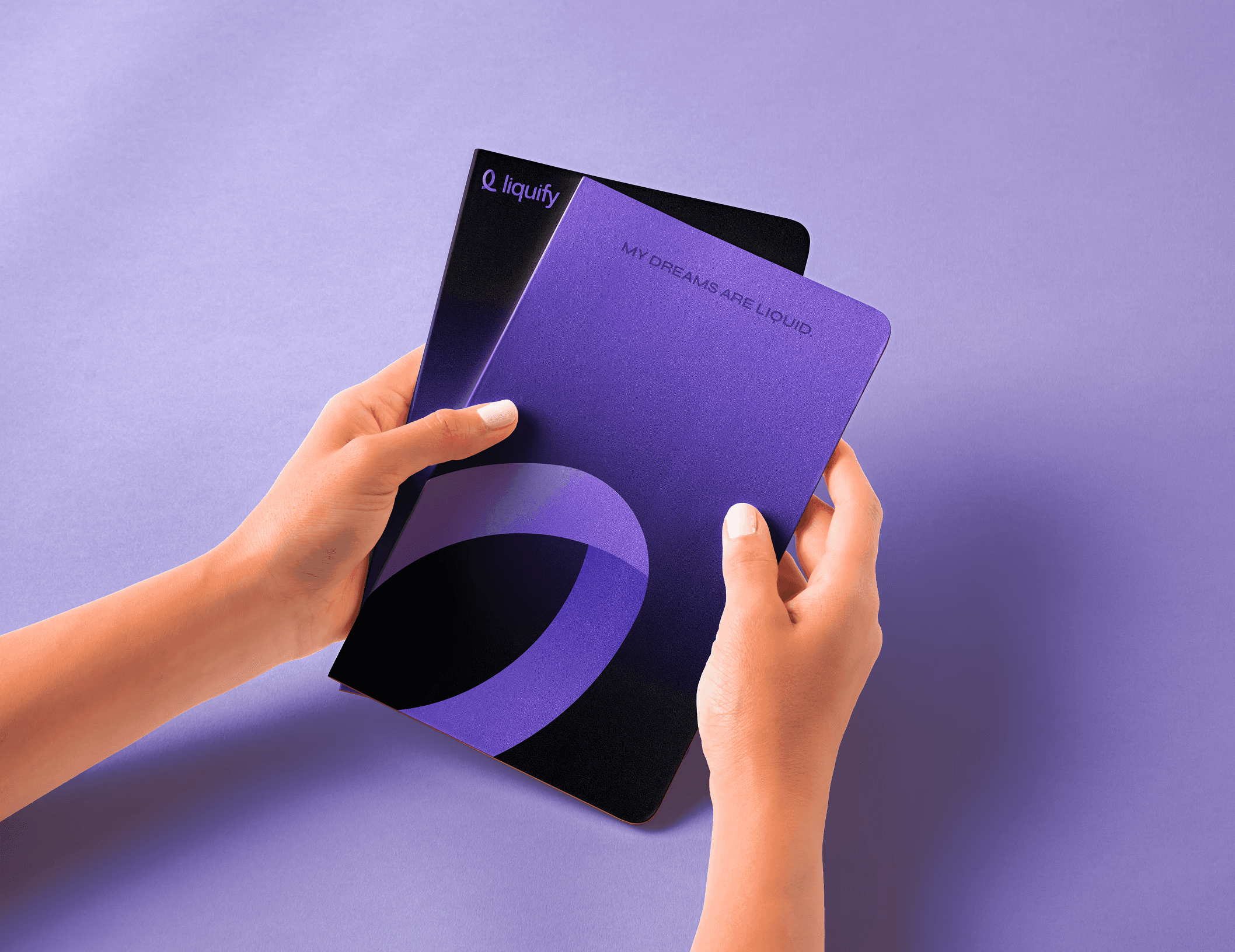
The logomark carries the same idea. We built "the Loop" — a lowercase "l" that curls into a circle, flat at the base, lifting into an upward flourish. Grounded, then rising. The gradient shifts from a deep blue-purple to a lighter shade across the loop, so the mark itself performs the thing the brand promises: potential becoming liquid, sitting still becoming moving.
Positioning followed the same logic. Not "manage your wealth" — the category's default pitch — but "your investments, working as hard as you do." The brand's job wasn't to sound like a bank. It was to make an unfamiliar action feel obvious the moment someone saw the name.


Creative Production
Full brand identity system: logo construction and lockup rules, primary and monotone logo variants, a blue-purple gradient palette, typography, and clear-space and sizing standards for a product that would live mostly on a phone screen.
Brand foundation work — mission, value proposition, five core brand values, audience definition — built to guide every future touchpoint, not just the ones we designed ourselves. Website UI/UX built to carry the same visual language from app to browser.

Results, not prophecies
The name did the explaining the product couldn't do alone. Liquify isn't what the company is. It's what happens when you use it.
Latest projects