©

Date
Feb 2026
Client
Somma
Industry
Wellness / Ayurvedic supplements
Timeline
6 Months

Creative Strategy
The name did the strategic work before a single visual decision got made.
Sôma, the Greek word for the body, gave us the physical, neuroscience-literate half of the meaning — the soma is the core of a neuron, the seat of the system. Soma, the Vedic drink, gave us the ritual half — something ingested with reverence, tied to immortality, older than the wellness category by several thousand years. Neither meaning mentions hemp. Both meanings are about the body restoring itself. That's the brand.
Once the name did that work, the ingredient stopped needing to be the hook. Vijaya leaf extract appears on the site as one mechanism among many — next to Rhodiola, Ashwagandha, Holy Basil — described with the same scientific register as everything else, not singled out or hidden. The positioning line, "ancient wisdom, modern wellness," carries the actual thesis: Ayurvedic tradition and clinical precision, treated as one continuous system rather than two competing claims.
The visual system followed the same circular logic the name suggested. The wordmark and identity build around the "o" — Somma's own initial doubled into a repeating circular motif across the logo lockup, packaging, and digital assets. Not decoration. The circle is the idea: wellness as something that returns to itself, the same shape as the soma cell body, the same shape as a ritual completed and repeated.

Creative Production
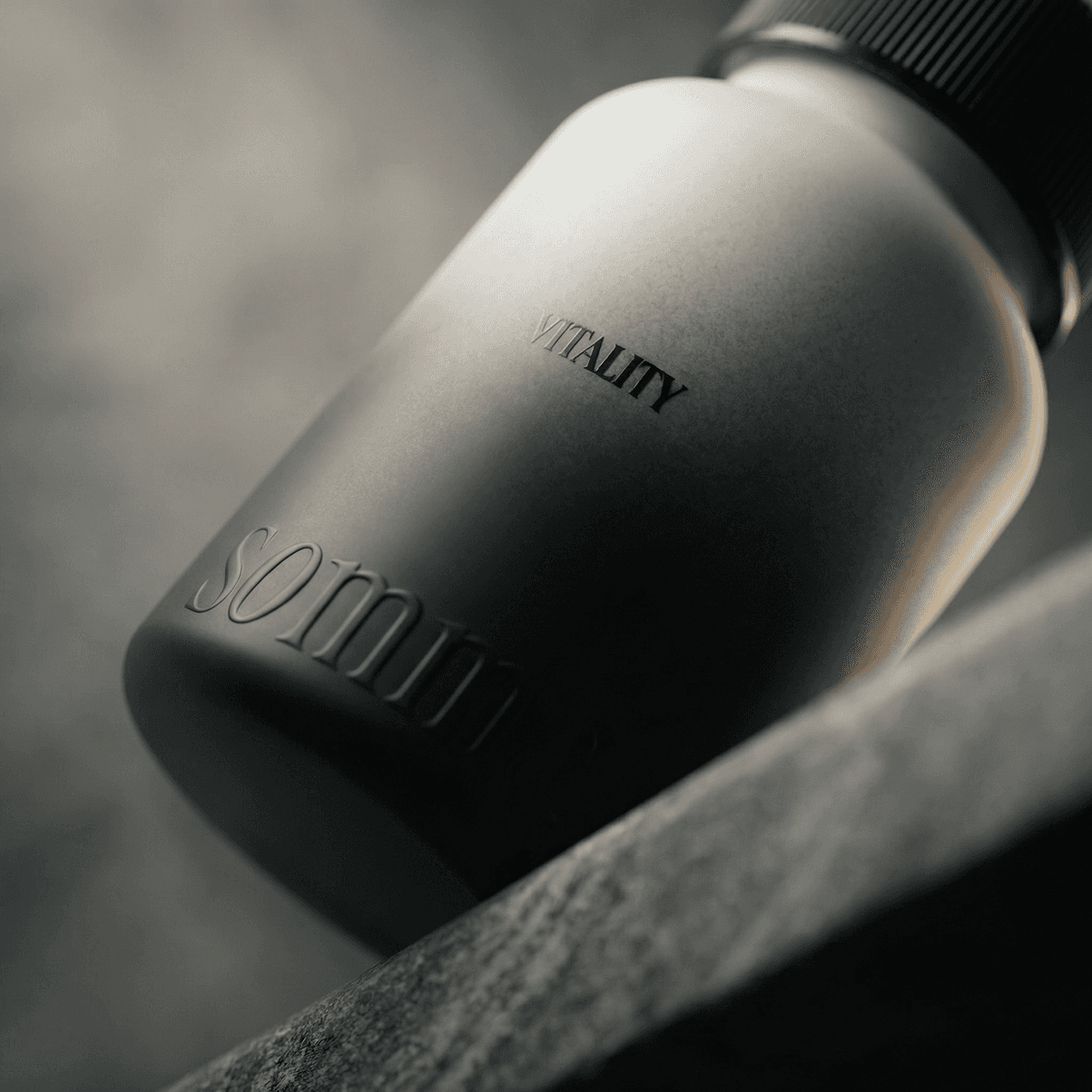
Full naming and brand identity system, including wordmark, monotone and colour lockups, and an extended "o" motif applied across packaging, signage, and digital.
Complete digital style guide covering typography, an earthy green palette, and iconography for five product lines (Sleep, Stress, Menstrual, Muscle, Vitality). Offline sale assets including signage board design. Photography and videography direction for product and lifestyle content. Full Shopify site build carrying the ingredient-as-science storytelling through to product pages.


Results, not prophecies
The name never mentions the ingredient. Neither does the logo. That was the point — the body doesn't need convincing, it needs continuity.
Latest projects